Difference between revisions of "API iup button"
| Line 21: | Line 21: | ||
''immouseover'' <br> | ''immouseover'' <br> | ||
| − | ''uv'' [uv]. Image part to show.<br> | + | ''uv'' [[uv]]. Image part to show.<br> |
| − | ''centeruv | + | ''centeruv'' [[uv]]. Set which region of the image to scale. (creation only) |
The specified rectangle will be scaled in both directions, the rectangles bordering on to top and bottom will be scaled horizontally, the ones to the left and right vertically and the ones to its corners will not be scaled | The specified rectangle will be scaled in both directions, the rectangles bordering on to top and bottom will be scaled horizontally, the ones to the left and right vertically and the ones to its corners will not be scaled | ||
Latest revision as of 00:22, 17 June 2010
Contents
button
Definition:
button{table attribs} -> userdata element
Arguments:
attribs element attributes
Returns:
element button
Description
Create a button
Official IUP documentation
Not all attributes in the docs work. If both the image and title attributes are set the text is displayed on top of the image instead of next to it.
Attributes
immouseover
uv uv. Image part to show.
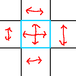
centeruv uv. Set which region of the image to scale. (creation only)
The specified rectangle will be scaled in both directions, the rectangles bordering on to top and bottom will be scaled horizontally, the ones to the left and right vertically and the ones to its corners will not be scaled
glowborder Set how many pixels the butten overlaps its surroundings
disabledtextcolorText color when the button is disabled
tip Set the tooltip. Setting this attribute also sets enterwindow_cb and leavewindow_cb (creation only)
